Monday, November 12, 2012

Don't let the pigeon bug the impressionist

One of the pleasures of being a father is reading to your children and one of the associated pleasures of reading to your children is discovering new books and authors to read to them.* I had never heard of Mo Willems until my wife returned from a trip to New York with Don't Let the Pigeon Drive the Bus, but our son took to it straight away. The premise is simple - the bus driver has to take a break and whilst he is away, we're under strict instructions not to let the pigeon drive the bus, however much he pleads ('your Mom would let me!'). My son took this lesson so much to heart that it is only very recently that he has stopped running up to pigeons in order to shout 'No!' (This sight was heartbreakingly cute when he was 2 - or stomach-churning, if you're a heartless cynic).

Willems, it turns out, is closely associated with Sesame Street, has won tonnes of awards (Caldecott, Carnegie) and has written lots of stuff. He has a good ear for simple dialogue, a smart sense of humour with sufficient appeal to adults to get you through inevitable multiple-readings-in-a-row and finds great expressive range in a deceptively plain-looking drawing style.
If you own copyright to this and want me to remove it - just let me know!

After the pigeon book, we graduated to 'Knuffle Bunny', the traumatic tale of a goggle-eyed girl called Trixie and her lost stuffed toy, and included 'Time to Pee' in our potty-training: it comes with mouse stickers, an excellent incentive (or 'bribe') for successful toilet-action. And recently we've acquired 'Knuffle Bunny Too', a sequel including the excellent (and, for us, resonant) line: 'Daddy tried to explain what 2.30am means'. Our children have taken to the iPad (in strictly controlled increments) and 'Don't Let the Pigeon Run this App' has been a great success: it is one of the few genuinely interactive apps for kids out there, allowing children to generate their own story by recording words that become incorporated into the narrative. Then, of course, they get to shout 'No!' a lot too. And there are still lots of books by him that we haven't got around to you.

Anyhoo, I mention all this because Willem's pigeon sprung immediately into mind when my friend, the historian CabinetRoom101 posted this picture of Monet and his wife on his twitter feed:


(I'm pretty sure he found it on the excellent Retronaut site.) Having posted a jokey tweet, I had to explain to CabinetRoom101, or Tim, as I prefer to call him, what I was talking about and then I couldn't resist a little doctoring. I meant to stop here:


But got carried away and wound up producing this:


Willems, I think, uses Adobe Illustrator or some such to produce the clever mixture of flat shapes and carefully scrappy lines, but I knocked this up on my iPad and then put it together using Pixelmator, so it's a bit rough in places.

Post Script: this is The Pigeon as drawn by my son, using the iPad app (heartless cynics, get stuffed):


*Other pleasures include, of course, that vicarious vampiric relish in your child's delight in story and the re-discovery of old favourites (hello Mr Gumpy! The tiger drank all of daddy's beer??)
** Other discoveries include the amazing Emily Gravett and Polly Dunbar (I love Penguin).

Monday, November 05, 2012

Sketchbook

For family reasons, I'm out of the country without access to a scanner. So I've put together a rather shaky flickr set of photos from my iPhone of a sketchbook that I started here. I wish I could say that I drew something in it everyday, not simply out of pride, but because my life has been immeasurably better on those occasions when I have managed to set aside a little time every day to draw something.

Here is the cover photo:

IMG_4518

And this link produces a slideshow (I hope - I still haven't figured out how to embed this properly):


By way of explanation of the odd, disparate things in this: A bald caricature of Neil Gaiman for a post that maybe I'll put up one day; my son's birthday list; attempts at sketching during the American presidential debates; a list of French vocabulary from reading 'Contes Cruels' by Villiers de l'Isle Adam; various animal sketches requested by my children; a series of sketches responding to an amazing set of photographs of would-be weathermen (and women); copies of portraits of Verlaine and Rimbaud as preparation for a set of blog posts that may one day manifest in the form of readings of French poetry / English responses to French poetry accompanied by pictures. And so on. I've left in the pages scribbled on by my children, because it's a working document.

Thursday, September 13, 2012

Fry Up


A couple of days ago, I clicked through a link from a post on Twitter about a caricature of Stephen Fry that had been drawn on an iPad, using the Adonit Jot Touch stylus. I've been curious about the Adonit Jot styluses since I read about them somewhere a while back (I think they were the object of a Kickstarter campaign). Their defining feature is a transparent circular disc at the tip of the stylus, which is presumably part of the the touch capacitive bit, since I gather that you need to generate a certain amount of surface area contact with the iPad screen in order to register with the device. The point of the Adonit transparent tip is that it allows you to see the point of contact with the screen and thus see more precisely where you're drawing.
In my own experiments with drawing on the iPad, I've stuck with the the Wacom stylus that I bought, mostly because I shelled out money for the bloody thing (it wasn't that cheap) and because the tip on the Adonit stylus looked a bit too delicate for our household (with two children under four years) and prone to breakage. When I heard about the 'Jot Touch' though, my curiosity was piqued, since it claims to allow you to vary the pressure when you're sketching: one big drawback with drawing on the iPad is the lack of pressure sensitivity. The app I use, 'procreate,' has some capacity to vary the thickness of stroke depending on how quickly you move the stylus, but I've found this hard to control to any useful degree. I'm very much enjoying figuring out how to paint on the iPad, but regret some of the flexibility and control that comes with using physical media.*
The caricature of Fry reminded me of my own juvenile effort for Broadsheet, fifteen years ago (gulp) and I posted a tweet that said as much (although, unsurprisingly, got no reply from Stephen Fry). I'm not sure the original was a good (or nice) joke about Fry's difficulties at the time, but it was my second attempt at caricature, I think (the first being a very crude rendition of Quentin Tarentino to accompany a review of 'Pulp Fiction') and I thought the likeness reasonable and was very pleased with.
So, the point of this rambling post is that I had another go, revisiting my original parody of Fry's 'Smooth Bar-steward' ads for Heineken. I've posted the painting I made on the iPad at the top and posted below an inked version of the pencil sketch I used as the basis for the iPad version (apologies for the poor quality - I don't have access to a scanner under present conditions) for comparison. For some reason, I think the inked version is a better likeness than the digital painting.

* Actually, the blog posting and video on the Adonit site is disappointing when it comes to unveiling the effects and advantages of the touch-sensitive version of their stylus. Nothing about varying line thickness, just a bit of warble about building colour. BIG HINT: If Adonit want to send me one for free, I'd be happy to put it through its paces (at $99 I can't afford to buy one) and blog about it extensively!

Wednesday, August 22, 2012

This is not a monotreme

A twitter exchange with my former student Catherine Bray about the Echidna or Spiny Anteater (one of only two species of monotremes) made me think of my Animal Encyclopedia. Since we're away from home at present, it's hard for me to track down the particular edition I have in mind: I was given it as a child and it has seen active service with my own two children recently. Everyone should have one.
Anyhoo, when I was about eight, I was obsessed with Bush Babies (the Echidna was a close second favourite), hence today's drawing:

(Oh, okay - I was twenty-eight.) I'm not sure what he's thinking - it's may be one of two extremes: 'Bright lights! Bright lights!' or 'What you lookin' at m*********?', or perhaps he's just hoping no will notice he's humping a tree ....

Thursday, August 16, 2012

Preparatory to anything else

He stayed in his walk to watch a typesetter neatly distributing type (Ulysses - Ch.6)


This is the post about how I put together the Gruffamookse image from last week. I'm writing this largely because my experiences with taking evening classes at the Glasgow School of Art have made me more reflective about process - a good thing, I think.

Firstly, materials. For family reasons, I'm living away from home for six months in Waco, Texas. This means that I don't have access to a lot of the materials that I would normally use. However, I'm lucky in that I recently invested in an iPad 3 (with the high resolution 'Retina' screen) and I have a laptop with Photoshop Elements on it, for manipulating the images I create with the iPad. I also have a trusty moleskine notebook and the pencils and pens I could fit into my bag.

I started by sketching out the basic images of the Gruffalo / Wyndham Lewis crossover and the Schefflerised-Joyce in my notebook. Then I photographed these images into the iPad and started work on them with an app called 'procreate'. I've tried a few drawing apps on the iPad over the past couple of years and, whilst it has a rubbish name, 'procreate' is by far and away the quickest and smoothest to use and it has a good range of tools. So I imported these images:


Then started work on them. First I traced the pencil image onto a top layer using an 'ink' brush. Throughout, I used a Wacom Bamboo Stylus, which handles really well. The only problem is that it isn't pressure sensitive: the app allows you to vary thickness of line using the speed of your brushstroke, but that is a cumbersome and disjointed way of achieving effects (developers are apparently working on pressure-sensitive styli for the iPad). I experimented a bit and found a brush that would more or less do what I want: Scheffler clearly works in ink, watercolour and a bit of gouache and I did find myself wondering whether I had created more work for myself my trying to reproduce this digitally instead of using similar materials myself. However when it came to colouring the images, the iPad was really useful and I was able to delete and make changes in a way that it is impossible when you're committing marks to hard copy. My basic pattern was to create a layer of base colour for most areas of the image and then work up detail in successive layers of colour. The first result was these isolated figures:

My plan was then to assemble them using Photoshop on the laptop. But the difficulties I encountered here, greatly increased my appreciation of Scheffler's original illustrations. One of the things I like about his work is the the depth and breadth of detail in his illustrations. I won't reproduce pages here, because I don't want to violate the copyright of his work, but there's a really intelligent rhythm to the way in which he moves between isolated details from a narrative and full-page scenes, including realised and detailed landscapes. We only have The Smartest Giant in Town with us in Waco, but it is full of examples. As a side note, this is something that the animated version of the Gruffalo brought to life really well - think of the way that the mouse's surroundings bristle with life (and death) as he passes through the 'deep dark woods'.

My own attempt to replicate this only revealed how bad I am this - how poorly thought out my images are when it comes to the whole composition. (My admiration for Scheffler's mise-en-page growing exponentially.) The result was a first image that I posted on twitter:


I then went back over what I'd done. The good thing about having created these images digitally, then turned out to be precisely that I could re-work them with relative ease rather than starting with scratch. I added the papal costume to my Gruffamookse:
Then spent some time figuring out (and admiring) the way that Scheffler draws trees, before coming up with the current image. It still needs some polish, but I do have another full-time career to work at (until someone spots that I've doing this rather than editing that volume ...).

Wednesday, August 08, 2012

Who's he when he's at home?


'Closer inspection of the bordereau would reveal a multiplicity of personalities inflictedon the documents or document' (FW 107)


It's a bad sign when you need to explain a joke, but my mum has no idea what I was going on about when I put together this picture, so here is the what, who and why of it and perhaps later I'll describe the how, because I have a nerdly interest in process. 

The origin of this picture was my attempt to read the opening passage of Finnegans Wake to my daughter (16 months) in my excitement about receiving a copy of Finn Fordham's excellent new edition, published by Oxford World Classics. I've been a member of the Finnegans Wake Reading Group at the University of Glasgow for the past five years. I can't claim to understand the Wake very well, but discussing it with colleagues, students and interested parties from across Glasgow has been a real joy.

My daughter, however, had no patience with Joyce and I can't afford a copy of Stacey Herbert's unscrupulous and scandalous edition of The Cats of Copenhagen (a story Joyce wrote in a letter for his grandson). She demanded that we read Room on the Brooma children's poem by Julia Donaldson, illustrated by Axel Scheffler. Perhaps I'll write a post about why Room on the Broom is so good at a later date, but Donaldson and Scheffler are best known for their collaboration on The GruffaloSince I now inhabit the twitterverse, I posted a tweet about my daughter's rejection of the Wake and couldn't help adding that Scheffler should now turn his attention to illustrating it.

In the way of things, I received a reply about this from @tombonnick at nosy crow books, who actually works with Scheffler and it started me thinking about what it would look like if Scheffler did illustrate Joyce. The obvious place to start, it seemed to me, would be one of the two tellings of fables that Joyce works into the Wake. Aesop's story about the Fox and Grapes makes its way into the Wake as the Mookse and the Gripes in Book 1 Chapter 6; and there is a version of the Ant and the Grasshopper (who become the Ondt and the Gracehoper) in Book 3 Chapter 1.

As it happens, we read the Mookse and the Gripes last year in the Reading Group and I have been mulling over the way in which Joyce presents it as an instructive lecture from a grumpy schoolmaster to a group of badly behaved boys ('and you, Bruno Nowlan, take your tongue out of your inkpot!') ever since. (I've been wondering about turning this into the subject of a lecture for my course on Joyce, but that's another story.) One characteristic of Joyce's writing in the Wake is the way in which he combines different languages, stories, and points of literary reference. He does this at the level of story-telling, within sentences and, punningly, within individual 'portmanteau' words too. 

So, the elements floating around in the Mookse and the Gripes start with Aesop's story about a fox who first covets some grapes hanging from a tree and then consoles himself by declaring that they must be sour anyway. Into this Joyce folds a series of allusions to Pope Adrian IV  (Nicholas Breakspear), who was not just the only English pope (so far), but also managed to grant Henry II rule over Ireland in his papal bull Laudabiliter (Joyce had made fun of this in Ulysses). And finally (for my purposes) he also used this section of Finnegans Wake to take a crack at P. Wyndham Lewis, who had criticised Joyce in Time and Western Man. Amongst other things, Lewis accused Joyce of having ‘painful preoccupation with the exact place of things’ and crowed mistakenly over what he thought were errors of style in Joyce's writing (see how Hugh Kenner debunks this in Joyce's Voices). In retaliation, Joyce built laboured puns about time and space into the pedantry of his narrator ('eins within a space' 'my spatial inexshellsis' etc.)

So those are the elements that I tried to combine in my version. I based the image upon the well-known encounter between the Gruffalo and the Mouse (I'm using this image from the internet which is poor resolution, because it's there on the net and I don't want to violate any copyright by scanning a fresh image directly from the book; I'm happy to replace this image or remove it.).


Then I used this image of Wyndham Lewis (publicly available through wikipedia), cross-referencing it with some other pictures:

And trawled the net for images of papal costumes (it's probably direly inaccurate).

This image of Joyce is widely available on the internet (again, I'm happy to take replace it, if it violates someone's copyright):

The idea of the final image was a tribute to both Scheffler and Joyce through a Wakean mashup of all these elements. Next post (when I get a chance) - how i dun it.


Monday, March 19, 2012

Page 22

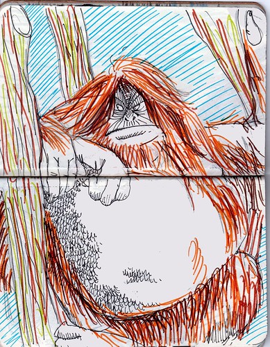
This one wasn't a direct request, but I couldn't resist. It's taken from a book about Monkeys given to me by our French au pair (Jackie?) before we left Birmingham when I was a child. We spent quite a bit of time looking through it and comparing the monkeys to members of my family. This one we compared to my sister. No, this is not much to my credit and will only fuel a recent controversy about the fact that I once compared her to Mavis Cruet. What can I say? I'm a terrible brother.

Page 11

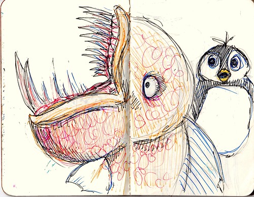
Not one of my favourites, but a direct request ('A scary fish that lives in the arctic where the penguins are'). It took some time to decipher this and it turned out that what was desired came from a talking penguin app on my iPad.

Page 7

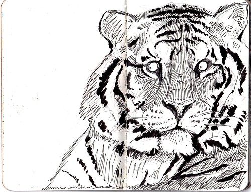
One of my favourites and one of a number of big cats in black and white in the notebook.

Sunday, March 18, 2012

More animals - the little notebook

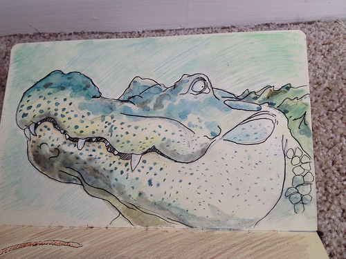
After a long hiatus, another set of animal pictures. At some point last year I asked my son for commissions and this is the list that we drew up (once I'd completed the first requests, we added more).


Then I tried to draw or complete one a day, using a pocket-sized cahier from Moleskine. Half way  through I discovered that other, more accomplished people were already doing similar things here and here, but ho hum. You may notice that there are still things on the list that I didn't fit into this notebook, and a recent request was made for 'more hyenas', so this may keep going. The complete notebook can be viewed as a flickr slideshow here and I've posted some individual images above, with comments added.

This should link to a flickr stream of the entire notebook. (Sorry, I haven't got the hang of this.) 

Regarding process: a couple of months into this, I came across Pinterest as a useful way of capturing and storing the reference images and created this stream:


This obviously has copyright implications: I think what I've done falls under 'fair use' and whatever theory of copyright underlies Pinterest. But if you own copyright to an image I've pinned and would rather that I removed it, just let me know via and I'll take it down.